

Data collected from web scraping can be processed and analyzed effectively using visuals such as bar charts, geographical maps, and line charts.
Python offers a rich variety of data visualization libraries, each with its unique features and capabilities, catering to the diverse needs of data analytics and data visualization.
This article focuses on the 10 best Python data visualization libraries, which can be used to create beautiful and complex data visualizations.
List of Best Libraries for Data Visualization in Python
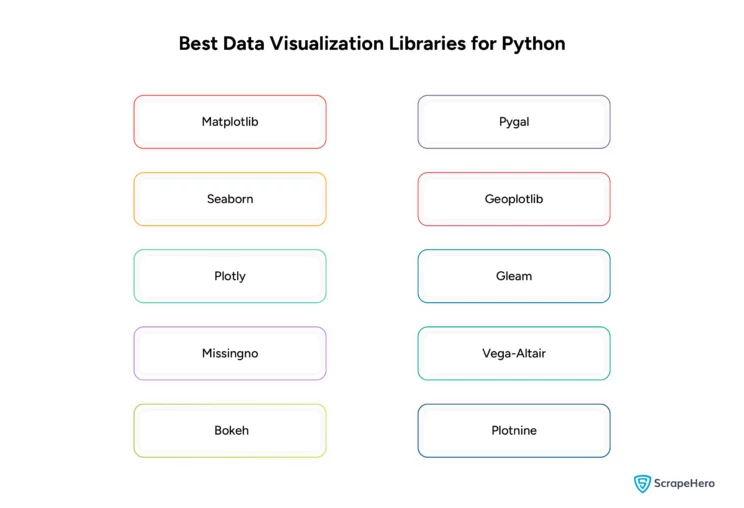
Given is a list of the best Python libraries that may help visualize the scraped data:
Let’s examine each library in detail, including its features, pros and cons, use cases, and usage examples.
1. Matplotlib
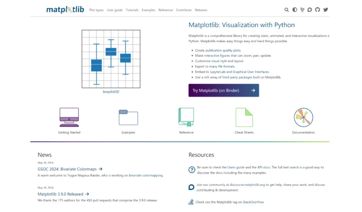
Matplotlib is a comprehensive library used to create static, animated, and interactive visualizations in Python.
It is a customizable plotting library used for visual data representations in scientific computing, data analysis, and artificial intelligence.
Features of Matplotlib
- Versatility
Matplotlib can be used to produce various plots and charts, including histograms, bar charts, scatter plots, error charts, box plots, and pie charts. - Customization
The user can customize almost every element of a figure, including size, color, labels, layouts, and styles. - Interactivity
Even though Matplotlib is primarily designed for static plots, it can integrate well with GUI toolkits such as PyQt and Tkinter, providing more interactive features. - Integration
It also works well with many operating systems and is compatible with NumPy and Pandas, making it a convenient choice for data analysis. - Export Options
Plots can be saved in various file formats, including PNG, PDF, SVG, and EPS.
Use Cases
- Web Scraping
Matplotlib is used in web scraping to visualize scraped numerical data trends through customized plots. - Scientific Papers
Researchers use Matplotlib to create graphs for papers and presentations. - Finance
Analysts can use Matplotlib to create plots for financial reports and trend analysis. - Engineering
In engineering, Matplotlib is utilized to visualize data from tests, simulations, and analyses. - Education
Teachers and students can use this library to generate graphs based on mathematical functions and data.
Pros
- Wide Acceptance
Being one of the oldest plotting libraries available for Python, it has a vast community and extensive documentation. - Robust
Matplotlib is capable of creating complex plots. - Control
It can offer detailed control over plot features.
Cons
- Learning Curve
Users may find the style and syntax of Matplotlib quite challenging compared to more modern libraries such as Seaborn or Plotly. - Aesthetics
It has default styling, which may be less attractive than newer libraries. - Performance
It could be faster with large datasets or very complex visualizations.
Example Usage
Here’s a simple example of using Matplotlib to plot a line graph:
import matplotlib.pyplot as plt
import numpy as np
x = np.linspace(0, 10, 100)
y = np.sin(x)
plt.plot(x, y)
plt.title("Simple Plot of sin(x)")
plt.xlabel("x")
plt.ylabel("sin(x)")
plt.show()
2. Seaborn
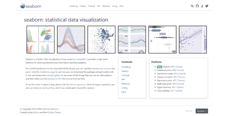
Seaborn is one of the Python libraries for data visualization built on top of Matplotlib. It is specifically used for statistical data visualization.
This library can generate informative statistical graphics by integrating with Pandas data structures.
Features of Seaborn
- Statistical Plotting
Seaborn has functions that visualize the data distribution for univariate and bivariate distributions. - Integrated With Pandas
It works well with Pandas data structures. - Color Palettes
It offers a rich set of color palettes for revealing patterns in the data. - Automatic Plotting of Linear Regression Models
Seaborn makes it easy to create models that quickly show complicated relationships in data. - Plotting Matrices of Data
It can generate heat and cluster maps, which help display data patterns. - Multi-Plot Grids
Detailed charts that organize and display different parts of the data together can be made with Seaborn.
Use Cases
- Web Scraping
Seaborn can be used to create aesthetically pleasing statistical visualizations from scraped data for insightful presentations. - Statistical Analysis
It is ideal for exploring and understanding data through statistical visualizations. - Machine Learning
It is useful in machine learning for understanding target distributions or checking model assumptions. - Biostatistics & Epidemiology
It is commonly used to display complex epidemiological data. - Marketing & Business Analytics
Seaborn is great for market research data, customer segmentation, and trend analysis.
Pros
- Aesthetically Pleasing
Seaborn’s default styles and color palettes are more modern and visually appealing. - Simplified Syntax
The simple syntax of Seaborn makes it easy to create complex visualizations like heat maps or violin plots. - Built-In Statistical Routines
Seaborn can do complex statistical plot types without a lot of extra coding. - Enhanced Functionality
Seaborn makes detailed charts by handling the complicated parts automatically.
Cons
- Less Flexibility
Seaborn is not as flexible, and for very advanced customizations, users might have to use Matplotlib. - Overhead
It is not the apt library for fundamental, quick charts. - Less Control Over the Figure
Since Seaborn simplifies some of the detailed settings, making particular changes to parts of the chart may be more challenging.
Example Usage
Here is an example showing how to create a violin plot in Seaborn:
import seaborn as sns
import matplotlib.pyplot as plt
# Load example dataset
tips = sns.load_dataset("tips")
# Create a violin plot
sns.violinplot(x="day", y="total_bill", data=tips)
plt.title("Distribution of Total Bills by Day")
plt.show()
If you want to know about some commonly used Python web scraping libraries and frameworks, you can read our article: Python Frameworks and Libraries Used for Web Scraping.
3. Plotly
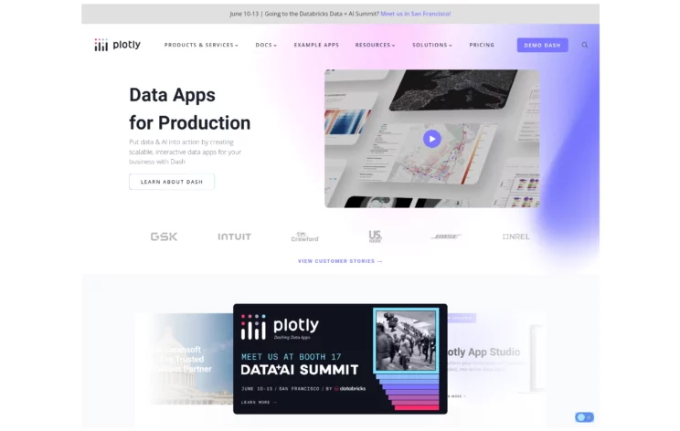
Plotly is a versatile graphing library for creating interactive, high-quality charts and graphs that can be easily integrated into web applications.
It supports multiple programming languages, including Python, R, and JavaScript, and is ideal for creating dashboards with Python.
Features of Plotly
- Interactive Visualizations
Plotly can produce interactive plots on which users can zoom, pan, and view extra information when they hover over them. - Web Integration
It can easily integrate with web technologies and allow dynamic visualizations in web reports and dashboards. - Wide Variety of Charts
It can support various charts, such as line charts, bar charts, scatter plots, pie charts, bubble charts, and 3D charts. - Collaborative
Plotly provides a cloud service that can host graphs, facilitating sharing and collaboration on visual projects. - APIs for Multiple Languages
It can seamlessly integrate into various projects and applications since it is available for Python, R, MATLAB, and JavaScript.
Use Cases
- Web Scraping
Plotly can develop interactive web dashboards from scraped data for dynamic user engagements. - Data Science and Engineering
It is ideal for exploring data deeply with interactive charts. You can include these charts in Jupyter notebooks or web apps. - Business Intelligence
Plotly is utilized by businesses to create dashboards that track key performance indicators in real time. - Academic Research
Researchers use Plotly to generate interactive graphs for online publications or presentations. - Finance
It is also used to monitor financial markets or visualize complex economic models.
Pros
- Interactivity
It allows a more profound exploration of the data, thus enhancing the user experience. - Attractive Visuals
It can produce aesthetically pleasing and professional-looking plots. - Versatility
Plotly is used across various industries as it supports a wide range of plot types. - Integration
It is easily embeddable into web applications and provides dynamic reporting capabilities.
Cons
- Complexity
It is more complex to use than libraries like Matplotlib. - Performance
Even though it can optimize data and plot configurations, it is slower with large datasets. - Cost
You must subscribe to paid plans to get some advanced features and hosting services by Plotly.
Example Usage
Here’s how you can create a simple interactive scatter plot using Plotly in Python:
import plotly.express as px
# Sample data
df = px.data.iris()
# Create a scatter plot
fig = px.scatter(df, x="sepal_width", y="sepal_length", color="species", size="petal_length", hover_data=['petal_width'])
# Show the plot
fig.show()
4. Missingno
Missingno is among the Python data visualization libraries that handle and visualize missing data. It integrates well with pandas and is especially useful during exploratory data analysis.
It is mainly used for data science projects to provide insights into missing data patterns within datasets.
Features of Missingno
- Matrix Visualization
Missingno allows users to quickly assess the extent and pattern of missing values by providing a heatmap-like visualization of the data’s completeness. - Bar Chart
It provides a straightforward visual summary of data by showing how missing data in one column is related to missing data in another. - Heatmap
It can highlight correlations of missingness between different columns in the dataset that indicate potential relationships in data absence. - Dendrogram
It uses hierarchical clustering to organize variables and help understand which variables similarly lack data, indicating a potential connection.
Use Cases
- Web Scraping
Missingno identifies the missing values in scraped data to ensure completeness before analysis. - Data Cleaning
It can identify missing data patterns, helping strategize how to handle them. - Data Analysis
It can assist in understanding the nature of missing data, which impacts statistical analyses. - Quality Control
It can diagnose data quality issues and ensure the datasets are robust and ready for further analysis.
Pros
- Ease of Use
Since Missingno has a simple interface for visualizing missing data, even those relatively new to data science can easily access it. - Efficient Exploration
It speeds up the data cleaning process by helping to identify trends and problems in data completeness. - Integration With Pandas
It works seamlessly with Pandas DataFrames, making it a natural part of Python data science workflows.
Cons
- Limited Scope
The functionality of Missingno is specialized, so it only extends beyond the analysis of missing data. - Visualization Limits
With massive datasets, the visualizations may become cluttered or less informative. - Dependency on Clean Data
The visualizations are compelling only when the data is already cleaned, i.e., the data should have the correct types in each column and contain no errors.
Example Usage
Here’s a simple example of how you might use Missingno to visualize missing data in a dataframe:
import missingno as msno
import pandas as pd
import seaborn as sns
# Load sample data
data = sns.load_dataset('titanic')
# Visualize missing data as a matrix
msno.matrix(data)
5. Bokeh
Bokeh is a dynamic visualization library for Python similar to Plotly. It can build complex interactive plots and dashboards embedded in web applications.
It provides an easy-to-use interface for creating interactive plots and allows for the creation of complex, detailed visual narratives.
Features of Bokeh
- Interactive Plots
Bokeh can produce interactive plots, including panning, zooming, and selection tools. - High Scalability
It can handle large amounts of data without a significant fall in performance. - Flexible Styling
It allows for creating highly customized visual presentations by offering extensive options for styling and formatting. - Server Integration
Bokeh Server can link user interface controls, like sliders, to visual displays, enabling the building of interactive web apps directly from Python. - Integration With Other Libraries
It works well with other data processing libraries like NumPy, Pandas, and Dask.
Use Cases
- Web Scraping
Bokeh is used to embed interactive visualizations in web applications using scraped real-time data. - Data Analysis and Exploration
Bokeh is functional for analysts to explore data interactively, especially within a web browser. - Financial Analysis
It is helpful for real-time data visualization and can create financial or economic dashboards. - Scientific Applications
It is used by researchers in fields like biology, meteorology, and astronomy to visualize complex data patterns and simulations. - Business Intelligence
Businesses can develop interactive dashboards to monitor key performance indicators in real-time using Bokeh.
Pros
- Interactivity
Bokeh provides an engaging user experience with easy-to-implement interactive elements. - Web-Ready
Since Bokeh is directly compatible with web standards, it can simply embed plots into HTML pages or server-based apps. - Versatile
It is suitable for various applications such as scatter plots, multi-plot layouts, etc. - Open Source
It is freely available and continuously updated by a community of developers.
Cons
- Complexity
The users face complexity when dealing with server components and linking behavior. - Performance
Performance is likely lagging when dealing with massive datasets or highly complex interactive visualizations. - Less Aesthetic Defaults
It may require additional styling work as the default visual styles are less polished than other libraries.
Example Usage
Here’s a simple example of how to create an interactive scatter plot using Bokeh:
from bokeh.plotting import figure, output_file, show
from bokeh.models import HoverTool
# Sample data
x = [1, 2, 3, 4, 5]
y = [6, 7, 2, 4, 5]
# Output to static HTML file
output_file("lines.html")
# Create a new plot with a title and axis labels
p = figure(title="simple line example", x_axis_label='x', y_axis_label='y')
# Add a line renderer with legend and line thickness
p.line(x, y, legend_label="Temp.", line_width=2)
# Add hover tool
p.add_tools(HoverTool())
# Show the results
show(p)
6. Pygal
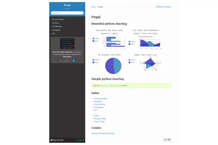
Pygal is one of the Python libraries for data visualization used to create interactive SVG (Scalable Vector Graphics) charts.
It strongly focuses on simplicity and can be easily integrated into web pages. It is well-suited for developers who need to generate charts quickly and with less complexity.
Features of Pygal
- SVG Output
Pygal generates scalable plots in SVG format that work well for responsive web design. - Interactivity
It is simpler than other libraries and supports basic interactivity, such as tooltips and links on elements. - Customization
It offers a variety of graph types and styles and allows customization of colors, labels, and other style elements. - Lightweight
It is lightweight and faster than many other visualization tools, making it a good choice for more straightforward needs. - Ease of Use
Pygal’s syntax is straightforward, so beginners can start generating plots quickly.
Use Cases
- Web Scraping
Pygal generates SVG plots from scraped data for web integration with minimal performance overhead. - Web Development
It is ideal for web developers who embed straightforward, interactive charts into web pages. - Education
It can be used for educational purposes like teaching basic data visualization with less complexity for students. - Rapid Prototyping
It is apt for data scientists and analysts if they need to quickly visualize data without using more complex libraries. - Reporting
It generates automated reports where visualizations are informative and easily embedded into HTML.
Pros
- Simplicity
Pygal is simple and easy to use, making it accessible to beginners. - Responsive Design
Since it produces SVG output, it can adapt to different screen sizes. - Lightweight
Pygal creates charts that are smaller in file size and less resource-intensive. - Interactive Elements
It supports interactive needs such as hover-over effects and clicking.
Cons
- Limited Scalability
Pygal may need to perform better with massive datasets. - Fewer Features
It lacks the level of interactivity provided by more advanced libraries like Plotly or Bokeh. - Limited Community and Support
Pygal is less used than other libraries, so fewer community resources and support are available.
Example Usage
Here’s how to create a simple bar chart using Pygal:
import pygal
# Create a Bar object
bar_chart = pygal.Bar()
# Title
bar_chart.title = 'Sample Bar Chart'
# Adding some values
bar_chart.add('Fruits', [5, 7, 3])
bar_chart.add('Vegetables', [2, 5, 8])
# Save the svg to a file
bar_chart.render_to_file('bar_chart.svg')
7. Geoplotlib
Geoplotlib is a Python toolkit for generating maps and plotting geographical data. It is built on top of Pyglet, a windowing and multimedia library.
It can visualize and understand spatial data, which is essential in many fields, such as geography, urban planning, logistics, etc.
Features of Geoplotlib
- Spatial Visualization
Geoplotlib can create thematic maps, which include choropleth maps, dot-density maps, and kernel density heatmaps.
Keen on choropleth maps? Here’s a tutorial to visualize location data from a CSV file as a choropleth map in QGIS. - Layer-Based Mapping
It allows the users to overlay multiple data layers onto a base map and display varied geographical information. - Interactive Tools
It has built-in tools for zooming and panning, essential for detailed map exploration. - Customization
It is flexible regarding styling and custom visual representations, like adjusting colors, markers, and line types.
Use Cases
- Web Scraping
Geoplotlib can map geographical data scraped from various sources to analyze spatial distributions. - Urban Planning
Geoplotlib maps city data like public transport routes, zoning, population density, etc. - Environmental Science
It can plot data on climate conditions, land use, pollution levels, etc. - Logistics and Transportation
It is ideal for route mapping, distribution centers, and network analysis. - Public Health
Geoplotlib is effective for visualizing data related to the spread of diseases, healthcare facilities distribution, etc.
Here’s an analysis of geographical distribution of retail health clinic locations in the US.
Pros
- Specificity to Geographical Data
Geoplotlib is designed explicitly for spatial data, making it a focused tool for geographic visualizations. - Interactive Exploration
Since it allows zooming and panning for interactive exploration of maps, it is specifically helpful for presentations and detailed analysis. - Layering Capabilities
It allows the addition of various layers to maps, which can then be tailored for specific analyses or presentations, especially for complex data visualization.
Cons
- Limited Scalability
Geoplotlib may not be able to handle very large datasets or extremely detailed geographic data, which can lead to performance issues. - Dependency on Pyglet
New users may require additional learning, as it relies on Pyglet. - Less Community Support
Since Geoplotlib is less adopted than other plotting libraries like Matplotlib or Plotly, fewer resources, and less community support exist.
Example Usage
Here’s an example of how you might use Geoplotlib to plot geographical data:
import geoplotlib
from geoplotlib.utils import read_csv
# Load data
data = read_csv('path/to/your_data.csv')
# Create a simple dot map
geoplotlib.dot(data)
geoplotlib.show()
8. Gleam
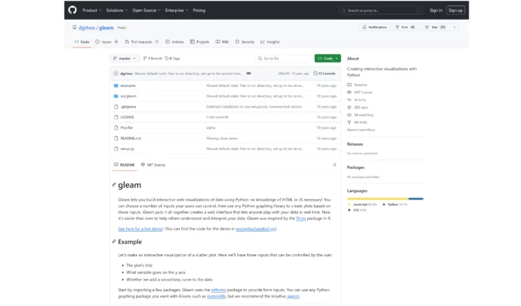
Gleam is a lesser-known library for data visualization in Python that converts data from Pandas DataFrames into interactive visualizations.
It provides a straightforward way to create visual presentations from Python scripts that users can explore interactively through a web interface.
Features of Gleam
- Interactive Web Apps
It allows for a broader audience to explore data insights by enabling Python scripts to be transformed into interactive web applications. - Integration With Pandas
It works seamlessly with Pandas DataFrames, simplifying analysis conversion into visualizations. - Simple UI Elements
It supports essential user interface elements like sliders, text inputs, and buttons to interact with the visualizations. - Flexible Output
The visualizations generated by Gleam can be exported as standalone HTML pages or hosted as web applications.
Use Cases
- Web Scraping
Gleam can quickly convert Python data analyses from scraped data into interactive web applications. - Data Exploration
It is Ideal for data scientists who want to present findings in an accessible format. - Rapid Prototyping
It helps develop web apps to showcase data-driven insights without extensive web development expertise. - Education
Gleam is used in teaching to provide interactive visual demonstrations of data concepts. - Business Reporting
It is also suitable for creating interactive reports that help dynamically explore data.
Pros
- Ease of Use
Gleam provides a simple API that is easy to use.
To get APIs for web scraping, you can access ScrapeHero Cloud. - Interactive Data Exploration
It allows interactive manipulation through the web interface and enhances the exploration of datasets. - No Extensive Web Development Needed
Even without deep knowledge of web development technologies, the user can simplify the process of building interactive data applications.
Cons
- Limited Customization and Scalability
Gleam offers fewer customization options and scaling options, especially for large datasets, than libraries like Bokeh. - Lesser Known
Since Gleam is less recognized than other visualization libraries, it has less community support, fewer resources, and less documentation available. - Dependence on Web Server
It may require a public or local web server to share visualizations.
Example Usage
Here’s a simple example of how Gleam works:
import gleam as gl
import pandas as pd
import numpy as np
# Sample DataFrame
df = pd.DataFrame({
'x': np.random.randn(50),
'y': np.random.randn(50)
})
# Define a page with a plot
page = gl.Page()
page.add(gl.plot.Scatter(df, x='x', y='y'))
# Render the app
gl.render(page, open_browser=True)
9. Vega-Altair
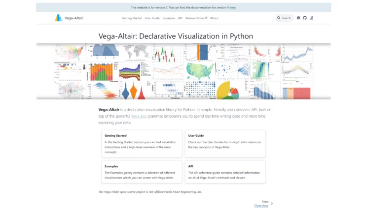
Vega-Lite and its Python API, Altair, create statistical visualizations in Python. Vega-Lite can simplify complex data visualization using a high-level approach, whereas Altair offers an easy-to-use Python interface.
Features of Vega-Altair
- Declarative Syntax
Altair uses a simple, declarative syntax to create and manipulate visualizations, so rather than how to construct it, you can specify what you want the visualization to include. - Composability
Vega-Lite’s grammar, which includes layering, concatenation, and repeating plots, allows Vega-Altair to build complex visualizations from simpler components. - Interactive Visualizations
It provides built-in support for interactive features like tooltips, selections, and zooming. - Integration
It can work well with Python data science stacks, especially with Pandas. - Exportability
The user can export charts as JSON specifications or render SVG or PNG images directly from the Python environment.
Use Cases
- Web Scraping
Vega-Altair uses declarative syntax to create and embed rich interactive visualizations from scraped data into web pages. - Academic and Scientific Research
It enables clear, reproducible visualization of data, which is crucial for analysis and publication. - Data Journalism
It creates rich, interactive stories that allow readers to explore the underlying data. - Business Analytics
By using Altair, businesses can visualize trends and metrics and integrate these visualizations into reports and presentations. - Data Science and Machine Learning
It helps to understand data distributions and relationships.
Pros
- Expressive Power
It can create highly complex and layered visualizations. - Reproducibility
Altair visualizations are defined in a JSON schema, which is reproducible and shared across various platforms. - Highly Readable Code
Altair’s API promotes readability and ease of use, making visualization code easy to write and understand. - Interactive and Web-Friendly
Since Altair uses web standards, it ensures that visualizations are ready for modern web environments.
Cons
- Performance with Large Datasets
It can become slow when handling large datasets as the entire dataset needs to be embedded in the notebook or HTML page. - Learning Curve
Even though it is more straightforward than many other visualizations, Altair’s declarative nature is only for some users accustomed to imperative programming styles. - Dependency on Vega-Lite
Since Vega-Altair depends on Vega-Lite, any limitations in Vega-Lite will also limit what can be done with Altair.
Example Usage
Here’s how you might create a simple scatter plot using Altair:
import altair as alt
import pandas as pd
# Creating a sample DataFrame
data = pd.DataFrame({
'x': range(10),
'y': range(10)
})
# Creating a scatter plot
chart = alt.Chart(data).mark_point().encode(
x='x',
y='y'
)
chart.display()10. Plotnine
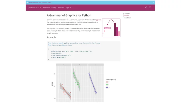
Plotnine is a Python data visualization library heavily inspired by the syntax and functionality of the popular R library ggplot2.
It is built on top of Matplotlib, integrates well with Pandas, and can create complex, publication-quality visualizations in Python.
Features of Plotnine
- Grammar of Graphics
Just like ggplot2, Plotnine also uses a grammar-based approach focusing on graphics in terms of layers, scales, and coordinate systems. - Layered Visualizations
Users can build plots layer by layer, adding annotations, statistical transformations, and other modular components. - Integration With Pandas
Plotnine works seamlessly with Panda DataFrames and directly turns complex data manipulations into visualizations. - Wide Variety of Plot Types
It supports a wide array of plots, including scatter plots, line graphs, bar charts, histograms, and box plots.
Use Cases
- Web Scraping
Plotnine utilizes ggplot2-like syntax for detailed plotting of scraped data for comprehensive analysis. - Statistical Analysis
It is an excellent option for statistical exploration and validation when there’s a need for complex, layered visualizations. - Academic Research
It is used in academic settings to create informative and suitable plots for publication. - Business Intelligence
It is employed in business contexts for exploratory data analysis and reporting. - Data Science Education
Plotnine also aids in teaching data visualization, helping students understand how plots are constructed from a theoretical perspective.
Pros
- Consistency With ggplot2
It offers a familiar environment for those accustomed to R’s ggplot2, easing the transition to Python. - Highly Customizable
It provides detailed control over every aspect of a plot for finely tuned outputs. - Expressive and Comprehensive
It can express complex multivariate relationships visually with minimal code. - Quality Output
It generates high-quality graphics that are suitable for professional reports and academic papers.
Cons
- Performance
When compared to other visualization libraries, it is slower with large datasets. - Learning Curve
The Grammar of Graphics can be initially challenging for first-time users. - Complexity
The layer-based approach may be complex in plot configuration, especially for new users.
Example Usage
Here’s a simple example of creating a scatter plot using Plotnine:
from plotnine import ggplot, aes, geom_point, theme, labs
import pandas as pd
# Creating a DataFrame
df = pd.DataFrame({
'x': range(1, 11),
'y': [2, 3, 4, 4, 5, 6, 7, 8, 9, 10]
})
# Plot
plot = (ggplot(df, aes('x', 'y')) # defining what data to use and how to map aesthetics
+ geom_point() # add point geometries
+ labs(title='Scatter Plot', x='X Axis', y='Y Axis') # add labels
+ theme_minimal()) # add a theme
print(plot)Wrapping Up
Python data visualization libraries can create aesthetic and informative data visualizations of the data scraped from various websites.
Since Python offers a wide range of visualization libraries, it is essential to understand all the libraries in detail and how to use them for further data analysis.
Furthermore, data visualization in Python has certain challenges, such as performance issues with large data volumes, limitations in standard libraries for dynamic updates, and scalability concerns.
Similarly, you might also encounter challenges involved in web scraping for your data needs. So, you need a reliable data partner like ScrapeHero to handle your scraping requirements.
As a fully managed enterprise-grade web scraping service provider, ScrapeHero offers custom solutions that provide hassle-free data to clients in various industries worldwide.
Frequently Asked Questions
Bar charts, scatter plots, and line graphs created using libraries such as Matplotlib or Seaborn are common examples of Python data visualization.
You can import Matplotlib and use its plotting functions to create various plots, such as histograms and pie charts.
You can use Pandas to manipulate data in Python. You can also use Matplotlib for basic plotting and Seaborn for statistical visualizations.
The best Python library for data visualization can vary based on the requirements.
Generally, Matplotlib is considered one of the best libraries for data visualization in Python.
Plotly is also an excellent choice for those needing interactive, web-based visualizations.
We can help with your data or automation needs
Turn the Internet into meaningful, structured and usable data


-,7.%20Geoplotlib,-Geoplotlib%20is%20a)