Data visualization is an incredibly effective way to communicate the results of your analysis. However, when it’s done poorly—like using misleading graphs or choosing the wrong type of chart—it can confuse your audience. Here are some common data visualization mistakes to steer clear of.
1. Using Data Visualization When It’s Not Necessary
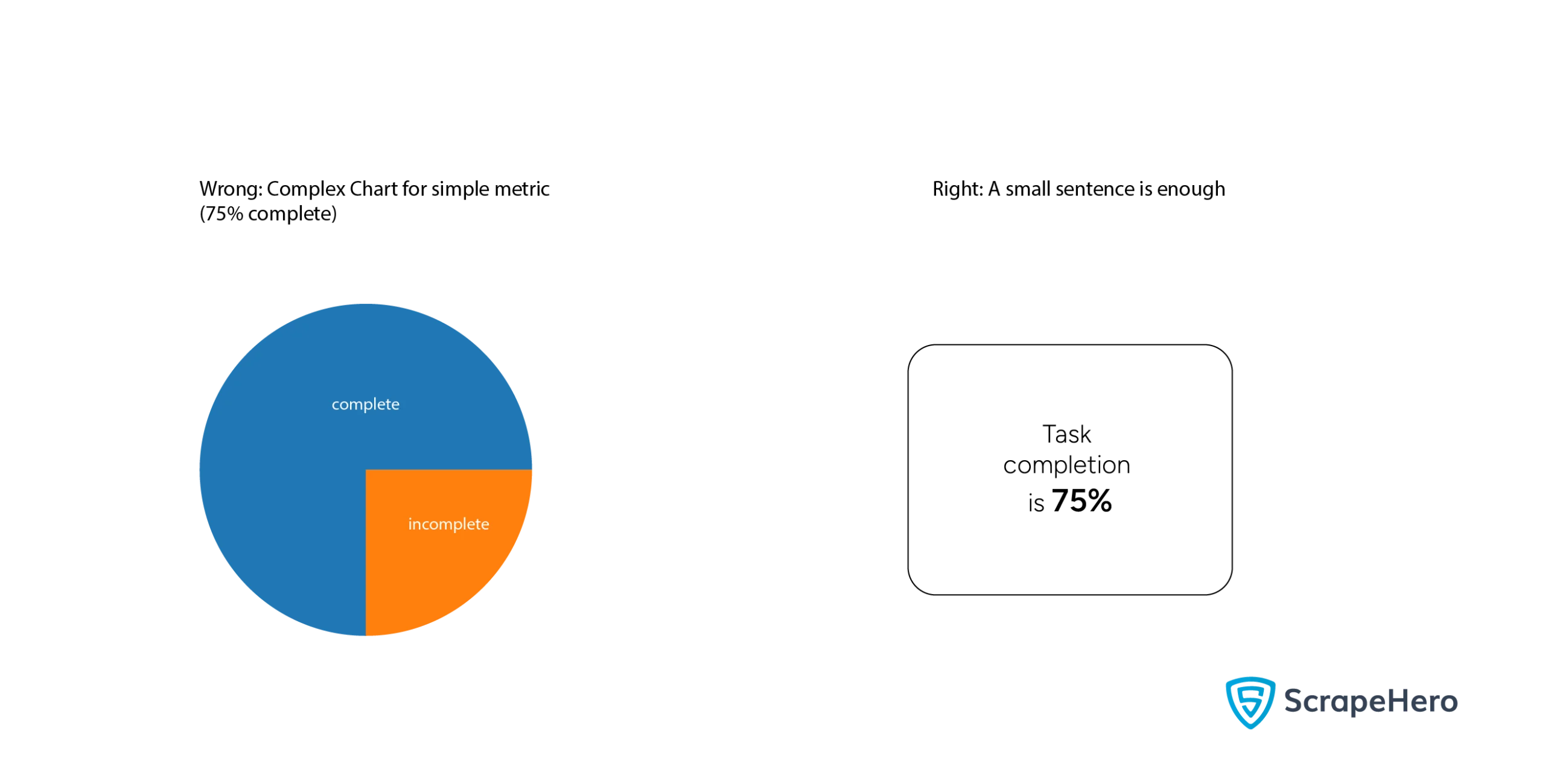
Graphs can improve the effectiveness of communication, but one of the most common data visualization mistakes is to use visuals when they aren’t needed. Sometimes, a simple sentence highlighting the key metric is more effective than creating a complex visual.
Best Practices:
Skip data visualization when:
- Data is straightforward, and visualization adds unnecessary complexity
- You’re drowning in data, and summary statistics would be clearer
- Your audience prefers plain numbers
- The risk of misinterpretation is high
2. Choosing the Wrong Graph
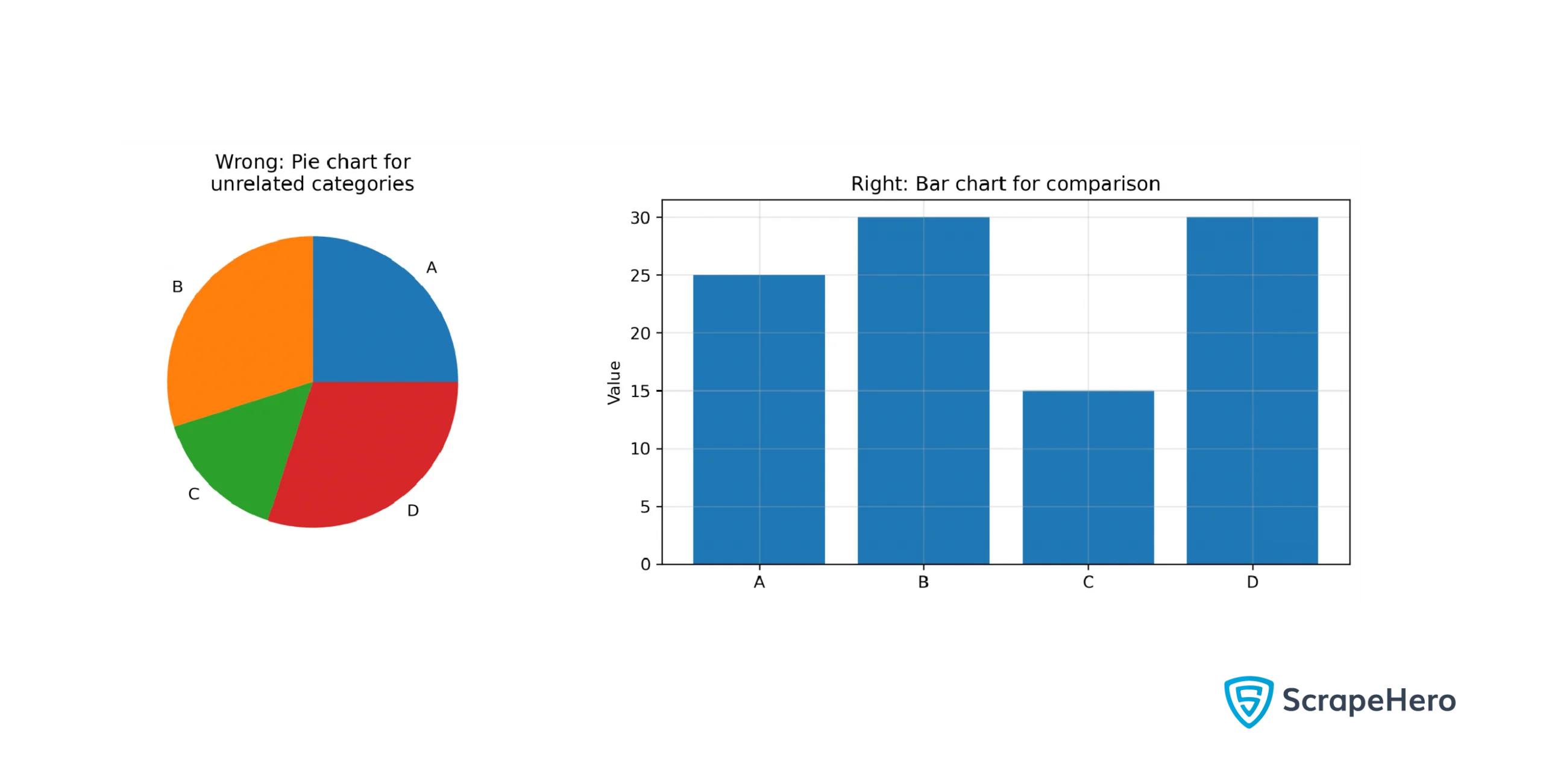
With tons of graphs available, picking the right one can be challenging. It’s crucial to choose wisely because each type serves a specific purpose.
For instance, pie charts are best suited for showing relationships between parts of a whole. Using a pie chart to compare unrelated variables might be misleading.
Best Practices:
- Understand your audience and use the chart more familiar to them
- It’s better to use
- Line chart for showing variation
- Bar chart for comparison
- Scatter plot to show correlation
- Pie chart to show proportions
- Choose the chart depending on the number of variables you want to represent
3. Overloading With Too Many Variables or Too Much Data
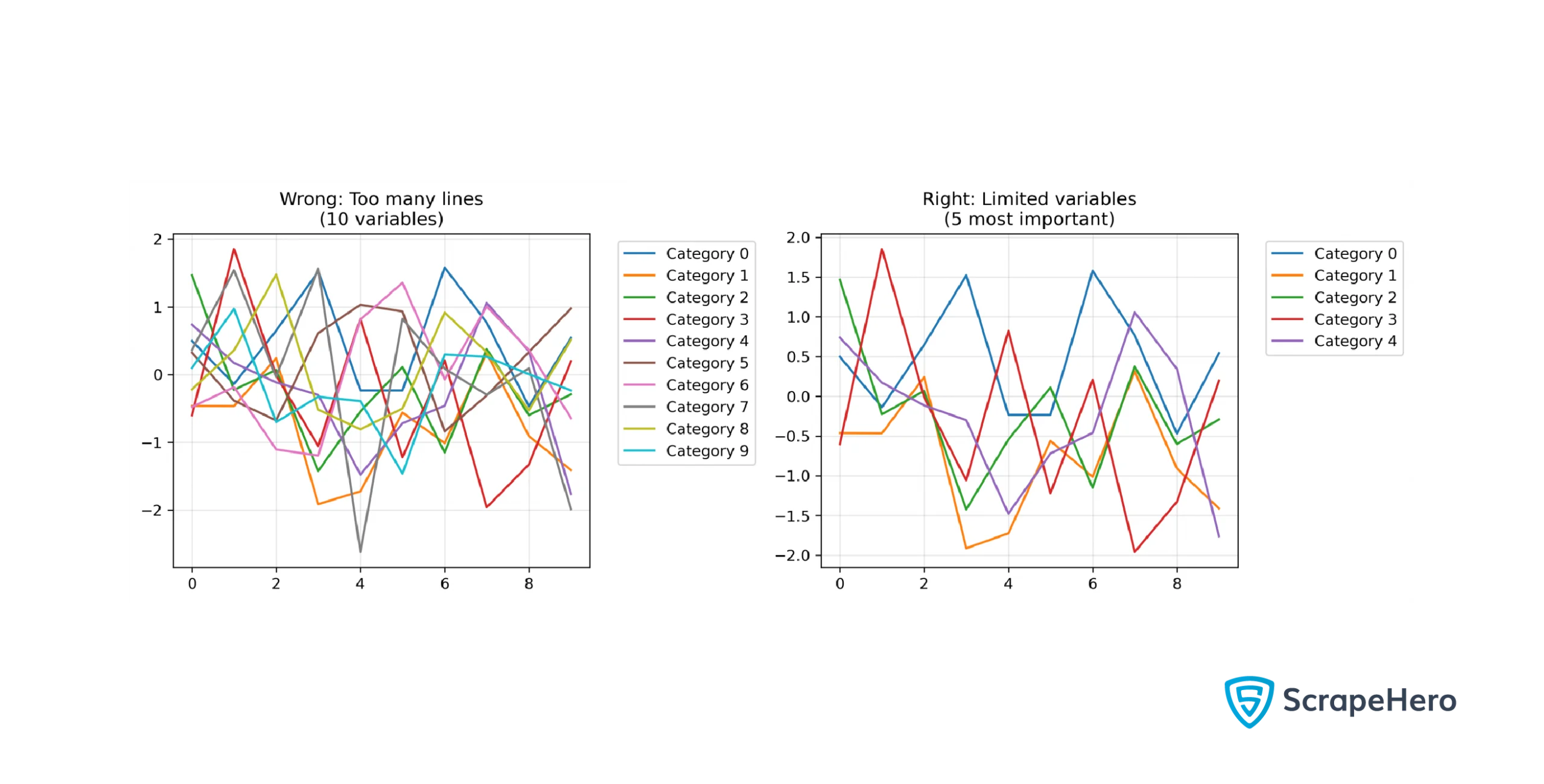
A primary instruction in data visualization guidelines is to show data clearly. So, too many variables or data can clutter a graph and hinder effective communication. Take time to decide how many variables to include for clarity.
Best Practices:
- Limit the number of variables based on the chart type:
- Pie charts work best for one variable
- Scatter plots or line charts can handle two variables
- Bubble charts can display three variables, with bubble size representing the third variable
- Radar charts are more suitable for plotting more than three variables
- Keep categories or series to 5-7 for clarity
4. Inconsistent Scaling
Scaling is crucial for how your chart will be interpreted. Consistent scaling across charts is essential, especially when making comparisons; otherwise, viewers might misinterpret the results.
Best Practices:
- Use a common scale across all your charts
- Adjust scales to graph area coverage
- Be mindful of probable distortions caused by scaling
- Ensure that tick marks are evenly spaced
5. Lack of Clarity Whether the Scale is Logarithmic or Linear
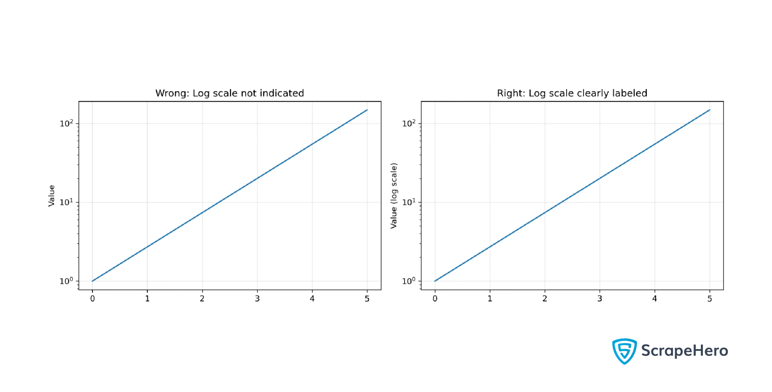
Graphs can use either logarithmic or linear scales. Linear scales space values evenly, while logarithmic scales change exponentially. Plotting the same dataset on both scales will yield very different graphs.
Not clarifying whether your graph uses a logarithmic scale can make viewers mistakenly assume it’s linear, which is more common.
Best Practices:
- Use a logarithmic scale for data that spans several orders of magnitude, like an exponential growth
- Use linear scales for datasets with negative or zero values
- Clearly label axes to indicate whether the scale is logarithmic or linear
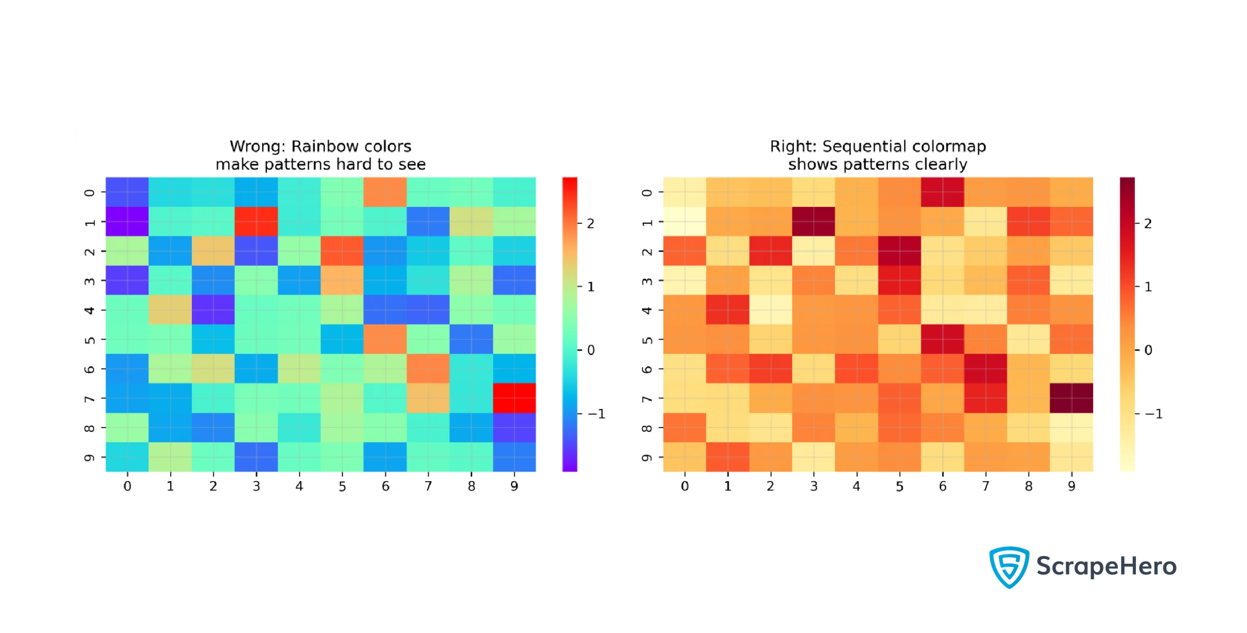
6. Improper Use of Colors
Colors can make your graph visually appealing, but using them incorrectly can lead to confusion. For example
- Poor color contrast
- Non-standard uses of colors
Poor color contrast can mislead the viewers into inferring discrepancies of higher magnitude than they are. For instance, darker shades in heat maps denote high temperatures, and lighter shades lower temperatures. That means if the contrast between dark and light shades is higher, viewers will interpret this as a higher difference in temperature, even if that is not the case.
Similarly, using non-standard shades may also create confusion. For instance, it would be confusing to use dark shades to represent lower temperatures in a heat map.
Best Practices:
- Choose a color pallet according to the representation:
- Qualitative pallets (distinct colors) are ideal for categorical data
- Sequential pallets (lighter to darker shades) work well for ordered data
- Diverging pallets (complementary colors) are helpful in showing positive and negative values
- Limit your chart to no more than ten colors in a chart and use consistent color assignments across visuals
- Stick to standard color meanings, like green for positive and red for negative
7. Selectively Showing the Data
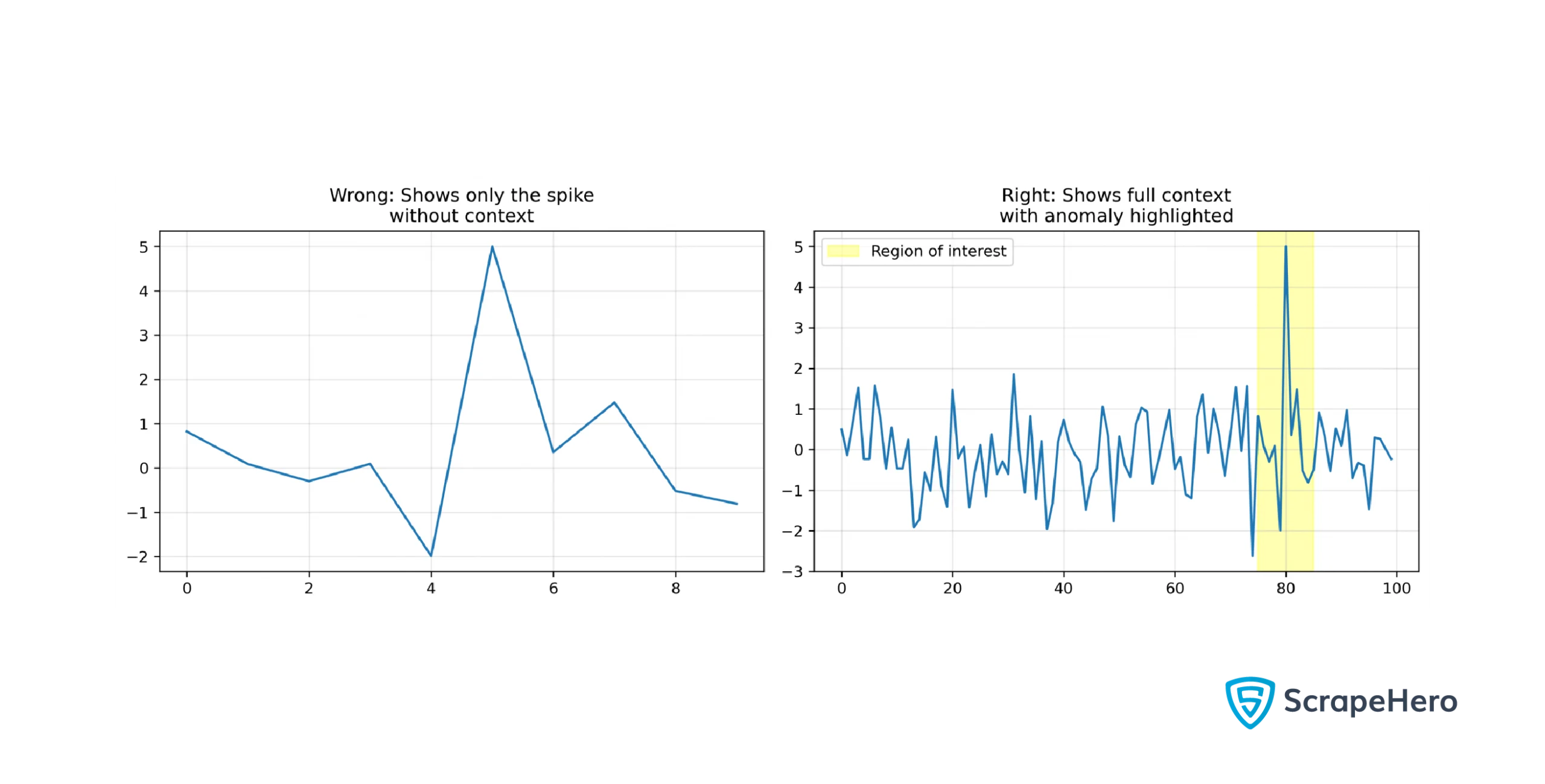
Focusing only on part of a dataset can support your argument but may mislead viewers by omitting contradicting information. If you want to highlight an anomaly, show the complete dataset to clarify that it’s an exception rather than a trend.
Best Practices:
- Explain why you are focusing on that part of the graph
- Show how the highlighted section fits into the larger context
- Acknowledge any omitted data in your visualization
8. Misleading Text Descriptions
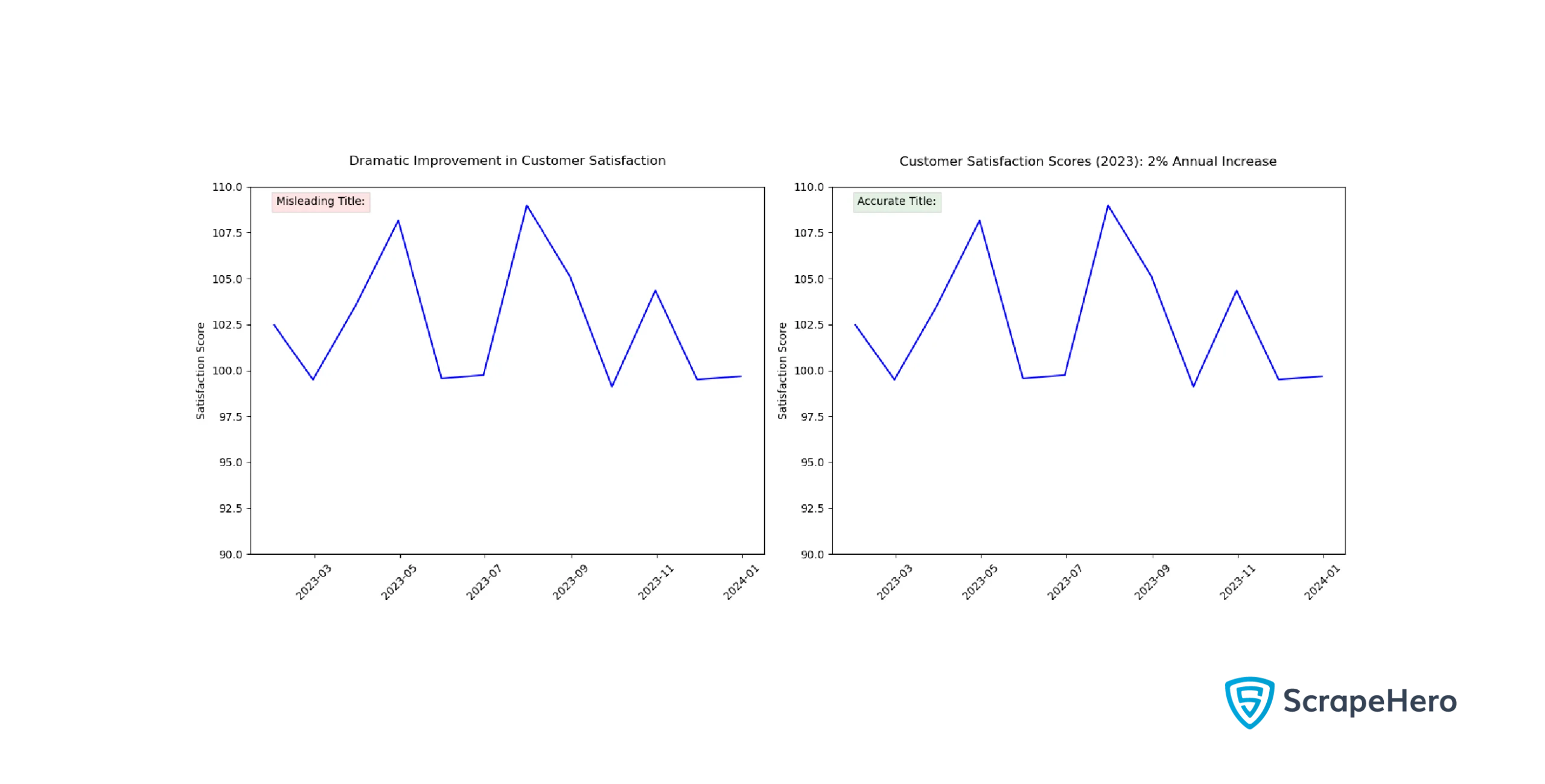
Descriptions accompanying graphs can clarify your message, but poor wording may mislead viewers.
Best Practices:
- Make sure all descriptions align with your intended message
- Don’t add descriptions for the sake of it; include them only when they enhance clarity
9. Using 3D Graphics Improperly
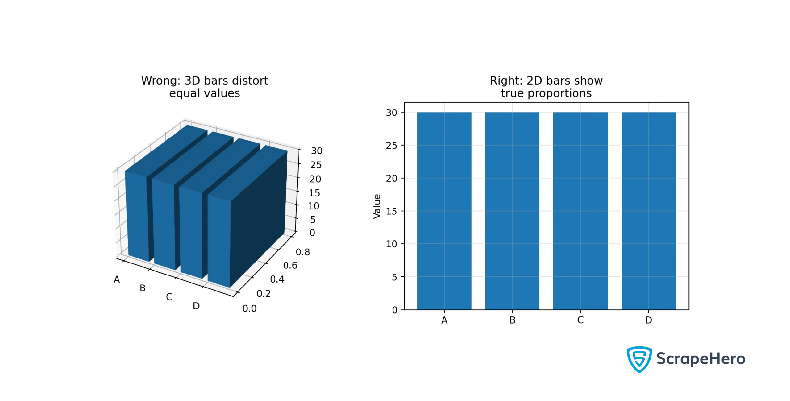
One of the common mistakes in data visualization among those focused on aesthetics is using 3D graphs unnecessarily. They can distort shapes and sizes due to depth effects. For instance, in a 3D pie chart, the upper sections may appear smaller than lower ones even if their values are larger.
Best Practices:
- Prefer 2D charts unless a 3D chart provides additional valuable information
- Ensure that any distortion in 3D charts doesn’t misrepresent data points
- Include legends and annotations to clarify what depth represents in a particular 3D chart
10. Choosing an Improper Baseline
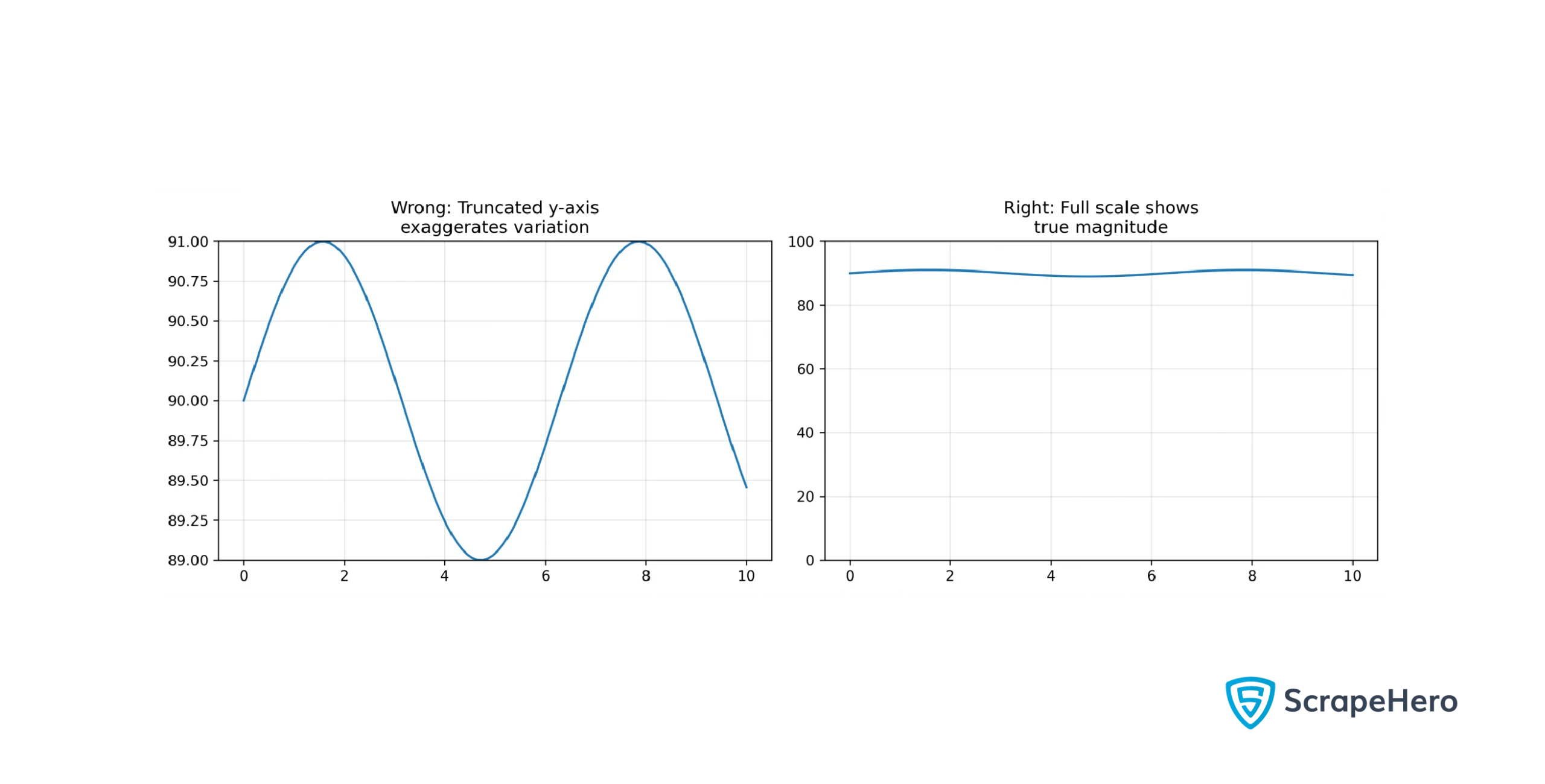
The baseline of a chart should ideally start at zero to prevent misinterpretation. Starting at a non-zero baseline can give undue significance to the slight variation of values.
Best Practices:
- Use a zero baseline whenever possible; this is crucial for bar charts but may be omitted in line charts if appropriate
- Be transparent about any omitted baselines
11. Not Clarifying Whether it’s Correlation or Causation
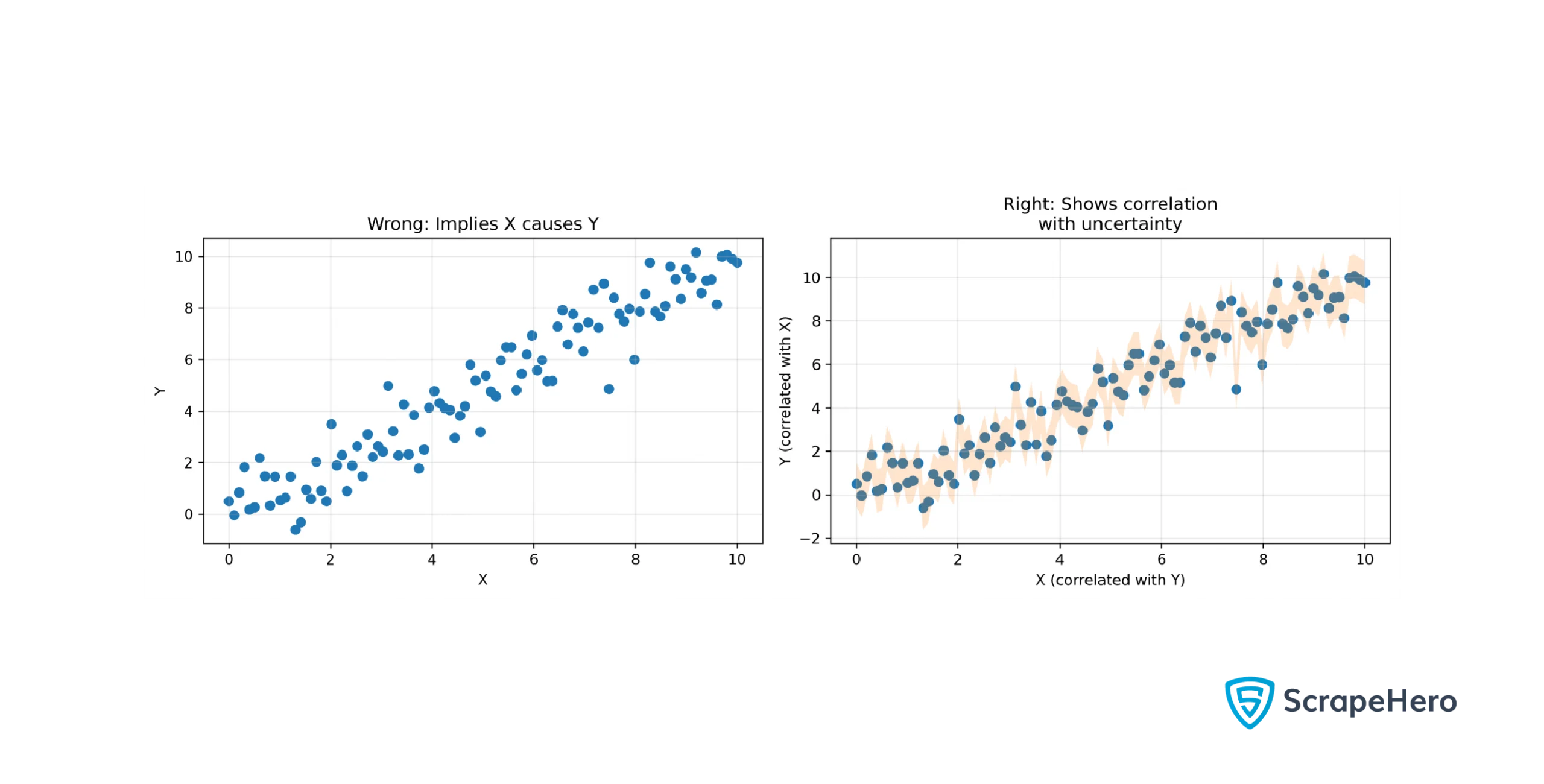
Showing correlations can be helpful, but merely doing so without context may lead viewers to mistakenly infer causation where none exists.
Best Practices:
- Clearly state that what you’re showing is correlation, not causation
- Provide context about the variables
- Use error bars to show the uncertainty in your data
The data visualization mistakes stated above are just starting points; always consider whether your choices will enhance or detract from effective communication. Moreover, it’s also important to choose the right data visualization libraries and tools for your project.
To practice data visualization, you need data. So, check out ScrapeHero Cloud; it’s a no-code solution to gather data.
Are you looking for tools to quickly visualize data? Check out this article on data visualization tools.
Wrapping Up
In today’s information-rich world, effective data visualization is essential for clear understanding. It’s also crucial to ensure that your visuals don’t mislead your audience. Hopefully, you can learn from the common mistakes to avoid in data visualization shown in this blog to create outstanding visualizations.
However, to achieve high-quality data visualizations, you need to start with reliable, high-quality data sources. A web scraping service like ScrapeHero can help you gather accurate and comprehensive datasets. ScrapeHero is a fully managed web scraping service provider specializing in building enterprise-grade web scrapers and crawlers.

