We publish a lot of data from around the web and people visit us from all around the world to read about the data and articles we publish.
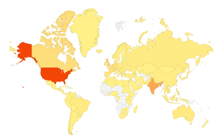
In this data bite we wanted to publish a map of where our visitors came from among the various countries in the world.
We had visitors from 135 countries last month
Here is a map (darker colored areas mean more visitors)

It is evident that our Africa outreach is lacking – anyone have ideas on how to reach more people in the gray colored areas?


