Have you ever wondered which domains appear most on Google search results? Read on to find out. This article analyzes Google SERP to find the domains that appear most number of times in Google search results.
The number of times a domain appears in Google search results is called impressions, which is very challenging to improve.
In the past, sneaky SEO techniques like keyword stuffing would have boosted your impressions. But now Google is becoming smarter. It can spot those tactics from miles ahead.
Recent changes in the Google’s algorithm have made matters more strict. Avoiding sneaky tactics alone may not be enough; you must also ensure your content is helpful.
Assuming the changes are effective, let’s determine the domains with the most impressions.
The Process
First, we determined the top 20 sites with the most impressions and performed sentiment analysis on their meta descriptions and titles. For this, we wanted to cover a broad range of search categories.
So we used a dataset containing 8,950 results obtained from a keyword set spanning 100 categories with 10 keywords in each category.
We used ChatGPT to select the categories and keywords randomly.
We also determined the category leaders, which are the domains with the most impressions in a particular category. We wanted to focus on a few well-searched categories to find category leaders.
That is why we used another dataset spanning only 10 categories, each with 855 results.
This time, we used Gemini to get the categories and keywords. To avoid potential bias, we did not use ChatGPT to get both datasets.
This analysis used data collected over a day as we only intended to learn about the current impressions and not the variation.
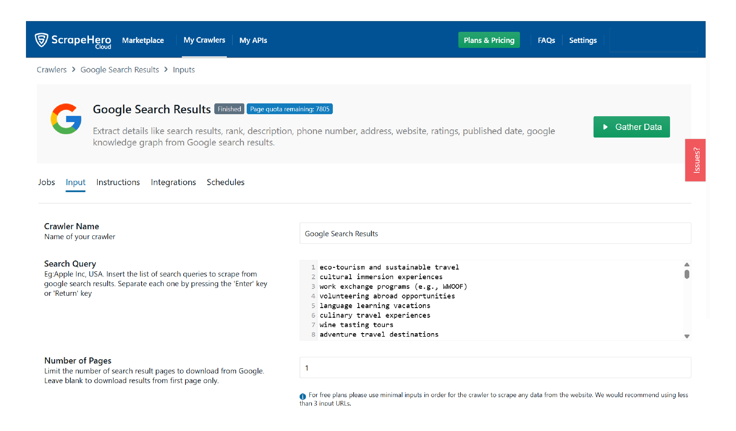
We used ScrapeHero Google Search Results Scraper from ScrapeHero Cloud to get the data. To analyze it, we used Python.
Top 20 Sites
The total impressions of the top 20 sites amounted to a whopping 21.4%. This number is huge because the top 20 sites mean a mere 0.48% of all the sites in the dataset.
Therefore, around ⅕ th of the search results came from the top 20 sites. Here is a plot showing those 20 sites and their impressions.
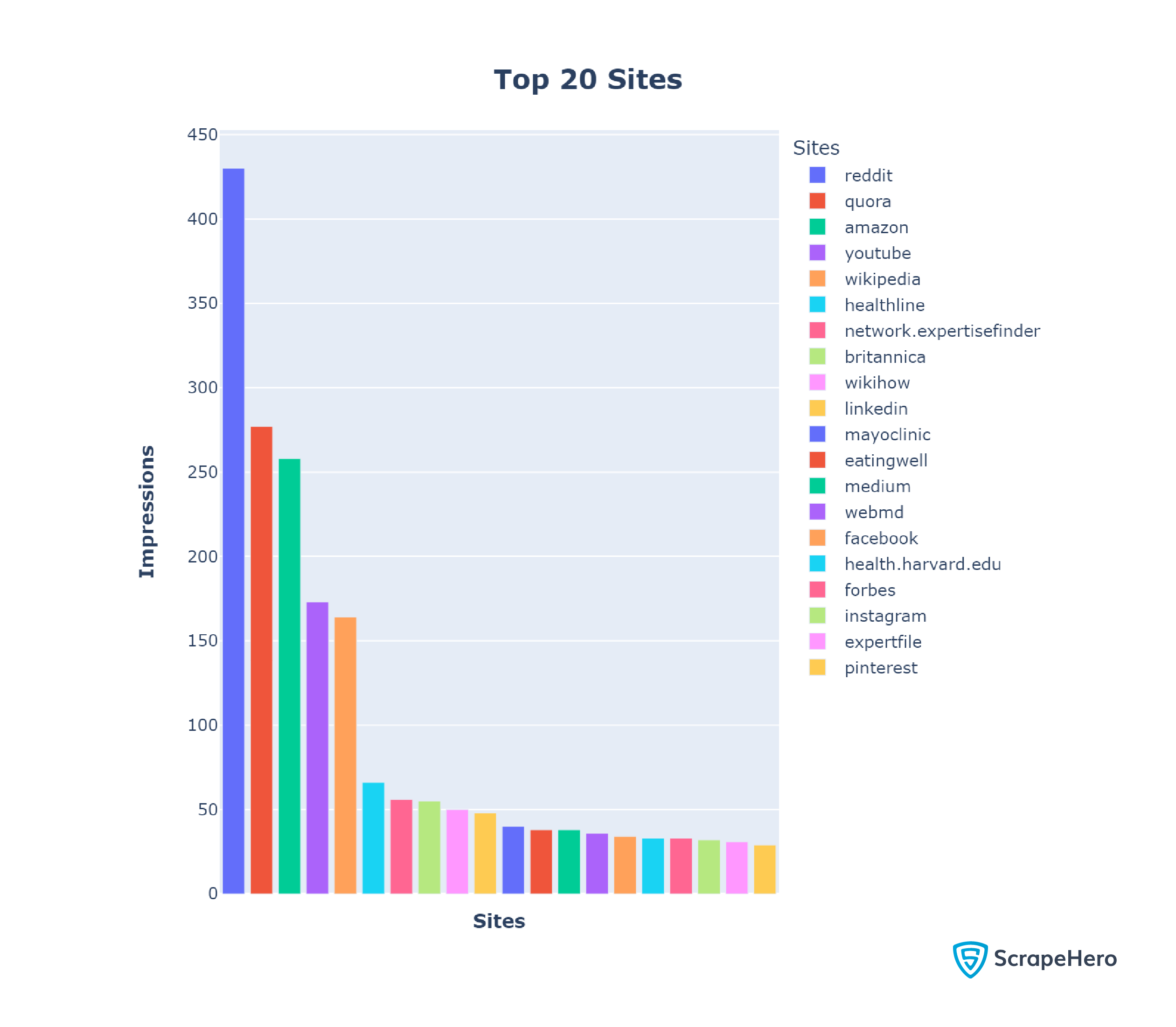
In our analysis, Reddit ranked #1 with 430 records, which makes sense as Reddit is a social media site where people discuss various topics.
Probably for the same reason, the other social media sites, including Quora (277 records), Facebook (34 records), YouTube (173 records), LinkedIn (48 records), and Instagram(32 records), also surface in the top 20 domains.
These results also point to the popularity of social media, as Google ranks the most popular sites first.
WebMD (36 records), Healthline (66 records), and Mayoclinic (40 records) are among the top 20 sites with the most impressions, highlighting Google’s desire to push original, well-researched content.
Category Leaders
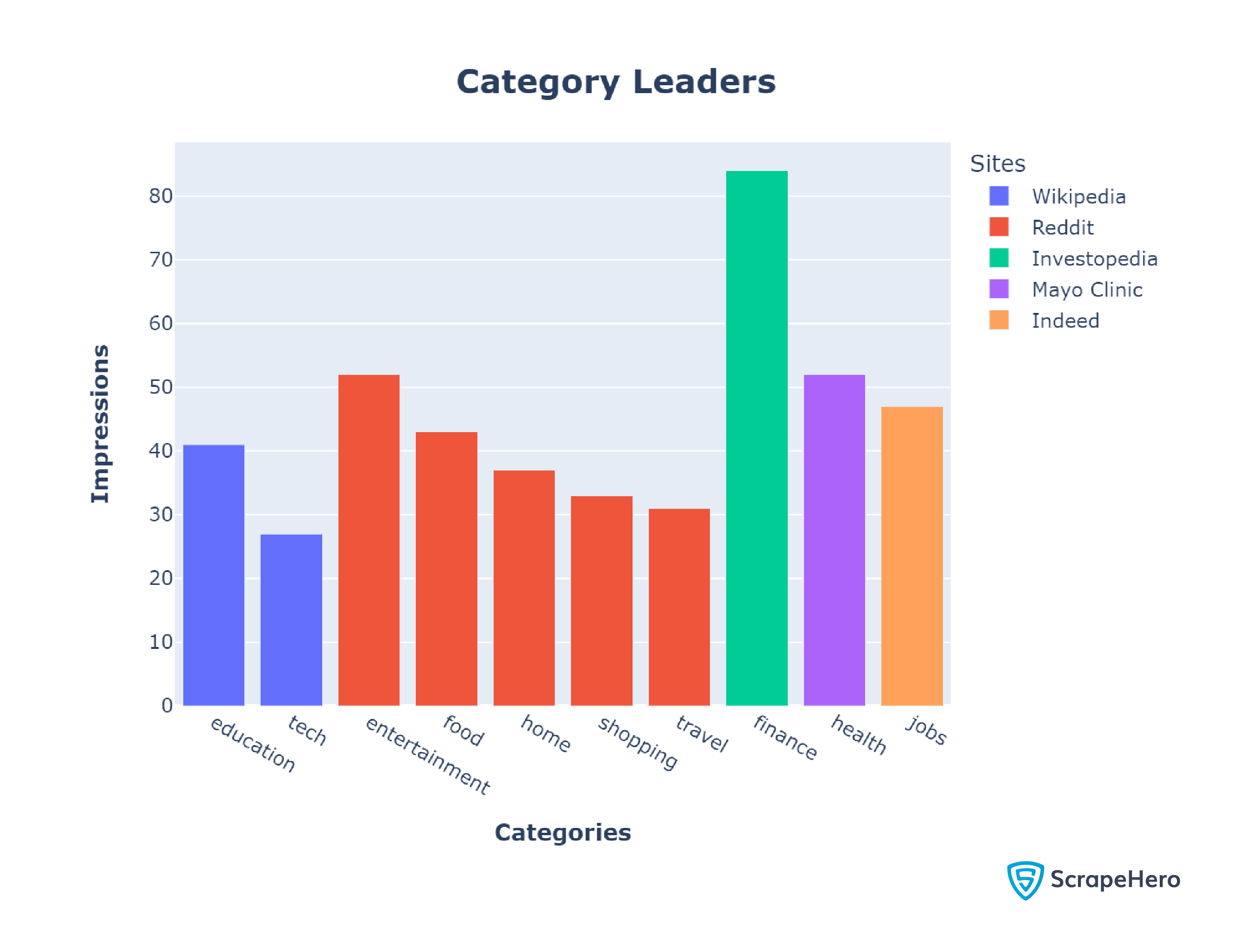
Reddit came on top in half of our categories: food, home, shopping, travel, and entertainment. Again, this may be due to Reddit being a social media platform where casual everyday discussions dominate.
Wikipedia ranked #1 in the education and tech categories with 4.8% and 3.1% of the results, respectively. This might be because websites in these categories, while knowledge-heavy, require less authority than those in Finance or Health. Therefore, it is unsurprising that an encyclopedia like Wikipedia dominates education and tech.
With 6.1% of the results, Mayo Clinic had the most impressions in the health category, which is not surprising as it also appeared among the top 20 sites with the most impressions.
Investopedia and Indeed, which didn’t reach the top 20, cleaned up the finance and jobs categories with 9,8% and 5.5%, respectively. This makes sense because while plotting the Top 20 sites, we used data from all 100 categories, making it difficult for niche sites to be front runners.
Sentiment Analysis
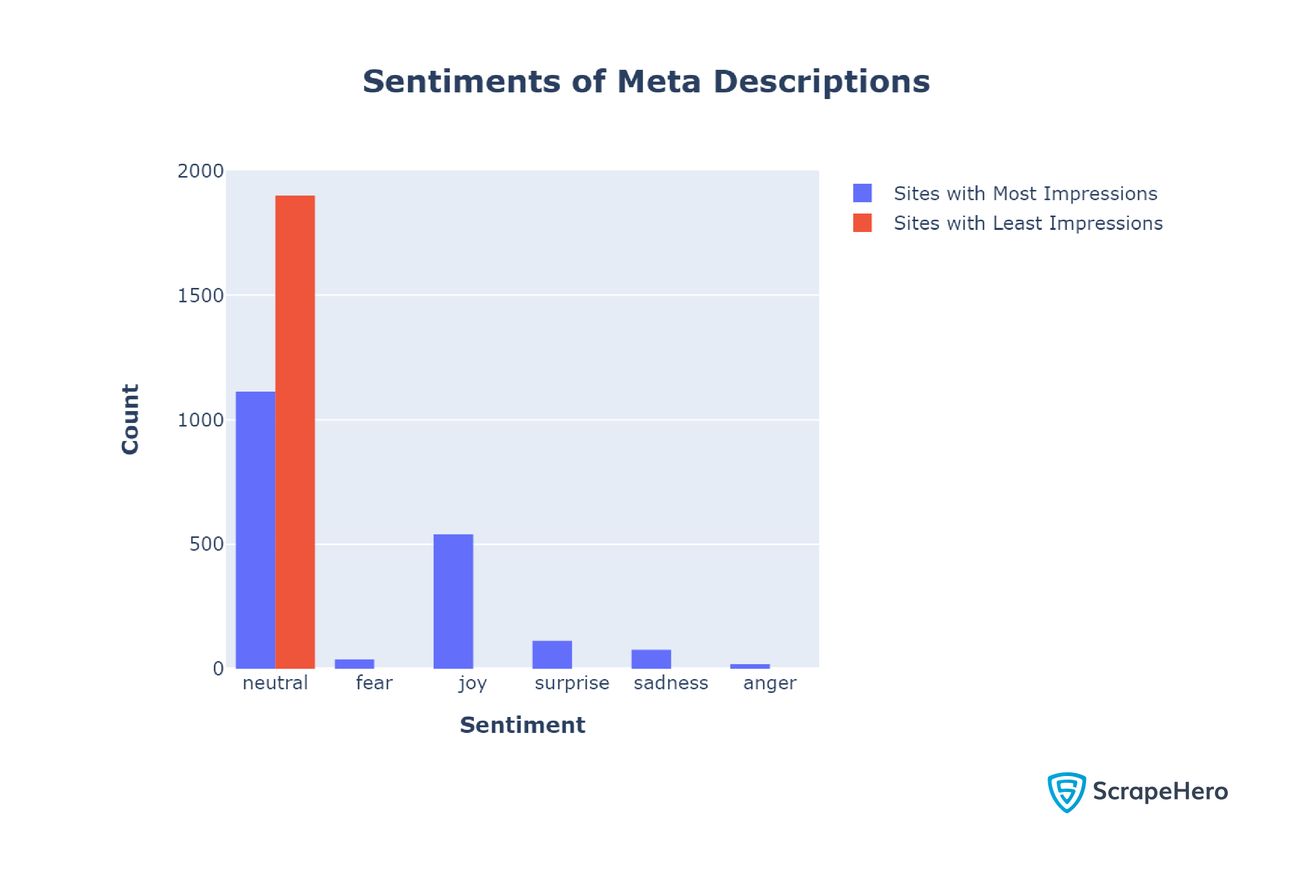
You can see that most of the sentiments are neutral. However, the analysis shows a difference between the sentiments of meta descriptions of the sites with the most and least impressions.
The sites with the most impressions used a mix of emotions in their meta description; 41.5% of their meta descriptions were non-neutral.
In contrast, the meta descriptions of the sites with the least impressions were entirely neutral.
This result suggests that using emotionality in your meta-descriptions may have a positive impact. However, a neutral tone may also work as meta descriptions with a neutral tone also surfaced.
Next, we analyzed the sentiments of titles.
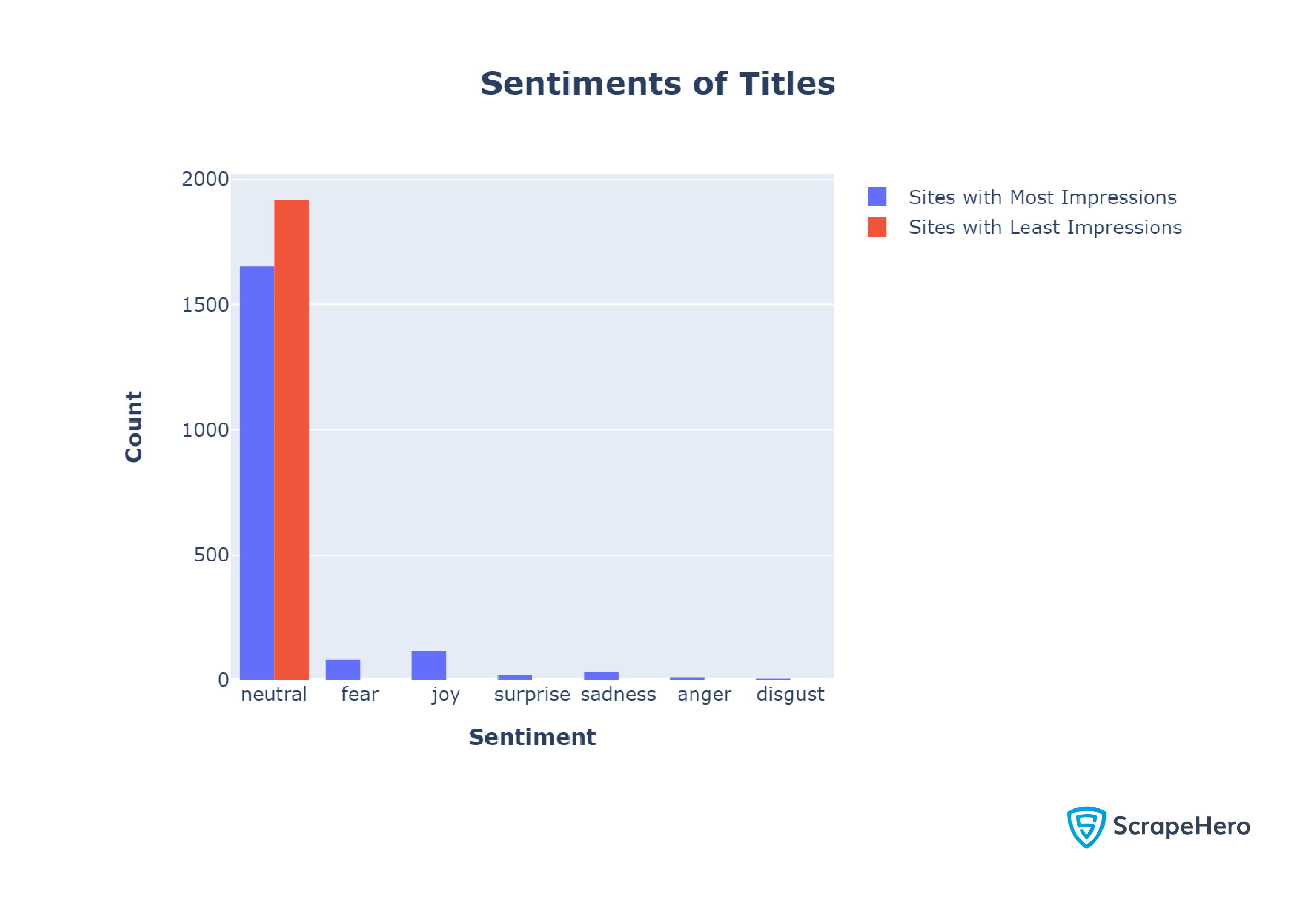
Like in the case of meta descriptions, websites mostly use neutral sentiments in their titles.
However, unlike meta descriptions, the titles of top sites were largely neutral. Only 14.00% of the top titles had non-neutral sentiments.
Getting the Search Results
We used ScrapeHero Google Search Results Scraper from ScrapeHero Cloud to get the search results. You can scrape Google search results using this scraper with only a few clicks.
First, we used ChatGPT to get a thousand queries from a hundred categories; it provided a CSV file containing all the queries.
We pasted queries into the input text box of our scraper, which you can find under the “Inputs” tab.
Finally, we clicked gather data and waited for the scraper to scrape Google search results. The scraper only took around 22 minutes to process 1000 queries, yielding 9951 records.
Gemini was used to collect search queries to determine the category leaders. For each category, we repeated the above process; it took around 3 minutes each.
We downloaded all the results as JSON.
Analyzing the Results
We used Python for our analysis. The packages used were
- Pandas
- Plotly
- The json module
- The re module
- Transformers
- NLTK toolkit
import json
import pandas as pd
import plotly.express as px
import plotly.io as pio
import re
from nltk.corpus import stopwords
from nltk.stem import SnowballStemmer
from nltk.tokenize import word_tokenize
import nltk
#nltk.download("punkt")
from transformers import pipeline
import plotly.graph_objects as goExcept for the re and json modules, install all other packages using the Python package manager pip.
- Pandas enabled us to manipulate data. It has methods for performing operations, like counting values and obtaining the maximum.
- Plotly was used for plotting. We used its module Express to plot the top 20 sites with the most impressions and category leaders. For plotting sentiment analysis, we used Plotly Graph Objects.
- We used the re module, the Transformers library, and the NLTK toolkit for sentiment analysis.
The analysis began with reading the scraped JSON data using the json module.
with open("data.json") as f:
searchResults = json.load(f)After loading the data, we
- Made a Pandas data frame using only the website names
- Counted frequencies of each website
- Made another data frame with the count
- Plotted the first 20 rows of the second data frame as a bar chart using Plotly
#making the Pandas data frame
sites =[]
for result in searchResults:
    website=result["url"].split()[0].split("/")[2]
    sites.append([website])
df = pd.DataFrame(sites,columns=["website"])
counts = df["website"].value_counts()
countFrame = pd.DataFrame({'Counts':counts.values},index=counts.index)
#plotting the graph
fig = px.bar(countFrame[:20],x=countFrame.index[:20],y='Counts',color=countFrame.index[:20],labels={"color":"Sites"})
fig.update_layout(
    title="<b>Top 20 Sites</b>",
    title_font_size=20,
    title_x= 0.5,
    xaxis_title="<b>Sites<b>",
    yaxis_title="<b>Impressions<b>",
    xaxis_tickangle=45,
    height = 700,
)
fig.update_xaxes(showticklabels=False)
config = {
  'toImageButtonOptions': {
    'format': 'svg', # one of png, svg, jpeg, webp
    'filename': 'custom_image',
    'height': 1000,
    'width': 1300,
    'scale': 1
  }
}
fig.show(config=config)
image = pio.to_image(fig,format="png",scale=2)
with open("Top20.png","wb") as f:
  f.write(image)
The search results for each category were in individual JSON files. Therefore, we read each file in a loop. In each loop, we
- Iterated through 855 results of each category, extracted the names of websites, and stored them in an array.
- Converted the array into a Pandas series and obtained the frequencies of various sites.
- Created a dict by using category as the key. For the values, we used the frequency and name of the site with maximum frequency.
sitesAndCategories={}
for category in categories:
sitesInCateogories = []
with open(f"data/{category}.json") as f:
categoryResult=json.load(f)
for result in categoryResult[:871]:
website=result['url'].split()[0].split("/")[2] if result['url'] else None
sitesInCateogories.append(website)
print(len(sitesInCateogories))
counts = pd.Series(sitesInCateogories).value_counts()
sitesAndCategories.update({category:[counts.idxmax(),counts.max()]})Finally, we plotted a bar chart with the extracted values.
values = [value[1] for value in sitesAndCategories.values()]
keys = list(sitesAndCategories.keys())
sites = ["Wikipedia","Reddit","Investopedia","Reddit","WebMD","Reddit","Indeed","Reddit","Wikipedia","Reddit"]
fig = ptx.bar(x=keys,y=values,color=sites,labels={"color":"Sites"})
fig.update_layout(
  title="<b>Category Leaders</b>",
  title_font_size=20,
  title_x= 0.5,
  xaxis_title="<b>Categories</b>",
  yaxis_title="<b>Impressions<b>",
)
config = {
  'toImageButtonOptions': {
    'format': 'svg', # one of png, svg, jpeg, webp
    'filename': 'Cateogries',
    'scale': 1 # Multiply title/legend/axis/canvas sizes by this factor
  }
}
fig.show(config=config)
image = pio.to_image(fig,format="png",scale=2)
with open("CategoryLeaders.png","wb") as f:
  f.write(image)
For sentiment analysis, we made three functions
- cleanData
- analyzeSentiment
- analyzeArray
cleanData
The cleanData function
- Converts the text to lowercase
- Removes punctuation marks
- Removes stopwords
def cleanData(text):
snowball = SnowballStemmer("english")
stop_words = set(stopwords.words("english"))
clean_text = []
t = text.lower()
t = re.sub(r"[^\w\s]"," ",t)
tokens = word_tokenize(t)
tokens = [snowball.stem(word) for word in tokens if word not in stop_words ]
t = " ".join(tokens)
clean_text.append(t)
return clean_textanalyzeSentiment
The sentiment analysis function calls cleanData() and uses the sentiment analysis pipeline of the Huggingface Transformers library.
It uses the “j-hartmann/emotion-english-distilroberta-base” model, which can predict 6 basic emotions:
- anger
- disgust
- fear
- joy
- neutral
- sadness
- surprise
def analyzeSentiment(text):
cleanText = cleanData(text)
sentiment_pipeline = pipeline("sentiment-analysis",model="j-hartmann/emotion-english-distilroberta-base")
huggingSentiment = []
huggingSentiment.append(sentiment_pipeline(cleanText))
return huggingSentimentanalyzeArray
This function calls analyzeSentiment() for each set of descriptions or titles and returns an array of sentiments.
def analyzeArray(descriptions):
sentiments=[]
i=1
for index, row in descriptions.iterrows():
website = row['Website']
description = row['Description']
try:
sentiment = analyzeSentiment(description)
print(f"done {i}",website,sentiment[0][0]['label'])
i+=1
except Exception as e:
print("nonetype description",description)
continue
sentiments.append(sentiment[0][0]['label'])
return sentimentsUsing analyzeArray(), we analyzed the sentiments of the meta descriptions of the sites with the most and least impressions, giving us two arrays.
We then plotted the histogram using the arrays in a graph using Plotly Graph Objects.
import plotly.graph_objects as go
fig = go.Figure()
fig.add_trace(go.Histogram(x=bigSentiments['top'],name="Sites with Most Impressions"))
fig.add_trace(go.Histogram(x=bigSentiments['bottom'],name="Sites with Least Impressions"))
fig.update_layout(
  barmode="group",
  title="<b>Sentiments of Meta Descriptions</b>",
  title_font_size=20,
  title_x= 0.5,
  xaxis_title="<b>Sentiment<b>",
  yaxis_title="<b>Count<b>",
)
config = {
  'toImageButtonOptions': {
    'format': 'svg',
    'filename': 'Sentiments',
    'scale': 1
  }
}
fig.show(config=config)
image = pio.to_image(fig,format="png",scale=2)
with open("SMD.png","wb") as f:
  f.write(image)
We repeated the process for the titles.
Concluding
This article discussed our analysis of Google search results obtained from ScrapeHero Google Search Results Scraper. In our analysis, Reddit came out on top, dominating 50% of the categories.
We also saw that emotionality in the meta-descriptions positively correlates with the number of impressions.
We used Python to analyze the search results, Python Pandas for numerical analysis, and Huggingface Transformers for sentiment analysis.
If you want to try these techniques but lack data, you can rely on ScrapeHero. You can either use ready-made web scrapers from ScrapeHero Cloud or try ScrapeHero web scraping services for large-scale projects.
ScrapeHero is a full-service web scraping service provider capable of building enterprise-grade web scrapers and crawlers. ScrapeHero services also include product and brand monitoring and custom robotic process automation.
We can help with your data or automation needs
Turn the Internet into meaningful, structured and usable data